GoCo Has a Fresh New Look!
With our latest fall product release, we’re excited to showcase a new fresh and modern look across the entire GoCo experience.
by Axel Norvell, Lead Designer @ GoCo - October 31st, 2022
One of our core values at GoCo is Evolve which means we’re constantly seeking ways to improve and become better versions of ourselves and these changes exemplify that in a big way.
Since our company’s founding back in 2015, we’ve constantly obsessed over the customer experience, especially when it came to our product experience. Making sure we make our experience easy, delightful and intuitive for companies and their employees is foundational to how we build our product.
Let’s take a look at some of the changes we made with these new updates 👇
New Navigation 🗺
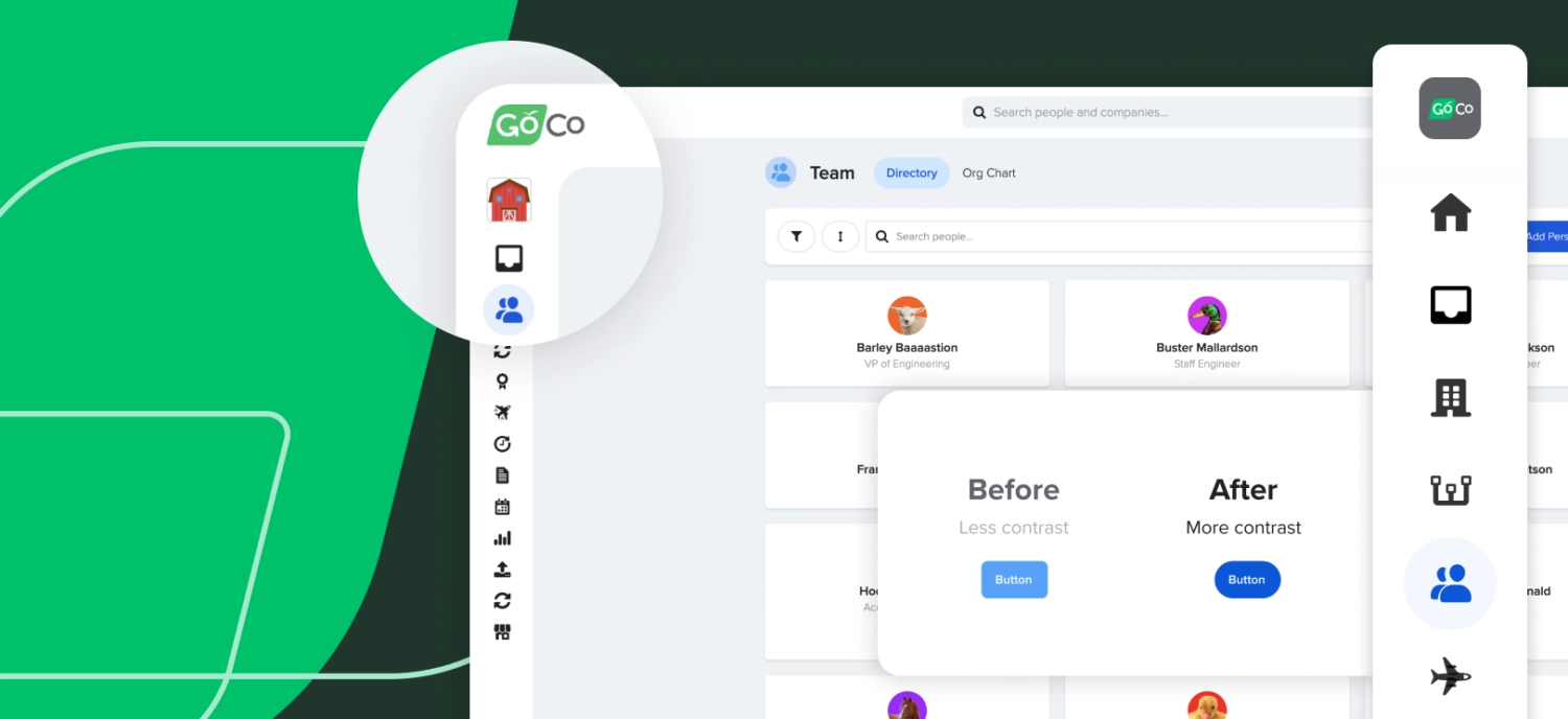
How you navigate GoCo and find what you need is one of the most important areas of the GoCo experience. We upgraded the left-side navigation to take less space on the page so there’s more breathing space to work in GoCo.

With the navigation collapsed, making sure it’s easy to understand all the navigation icons was super critical. Icons by themselves might not clear enough for most users so we made sure that the navigation animates out smoothly when a user goes to the menu:
[video width="1888" height="1080" mp4="https://www.goco.io/wp-content/uploads/2022/10/GoCo-UI-v2-sidenav.mp4" loop="true" autoplay="true" muted="true"][/video]
This animation is quick and smooth, but we also wanted to make sure people who liked the menu always open had a choice to do so. So we included a quick option to expand the menu and keep it open.
[video width="1888" height="1080" mp4="https://www.goco.io/wp-content/uploads/2022/10/GoCo-UI-v2-expand-collapse-menu.mp4" loop="true" autoplay="true" muted="true"][/video]
The last change we made was removing the footer area that used to sit at the bottom of GoCo. This footer used to take up precious space on the screen and block content. It also cluttered up the page a bit by adding content that most people didn’t use. So we made sure the most important links around help and support were moved up into the top right area of the app. Some of the most popular web apps like Slack, Gmail, Facebook, and YouTube do the same so we felt that it would be a familiar area to look for the help link.

Improved Text and Contrast 🔤
Making sure content is easy to read for everyone is foundational to a great user experience. With the new look, we darkened the text on screen and improved the contrast of colors to make sure everything was super easy to read.

Fun & Delightful Details 🎉
The last set of changes we made to our look was to add in more delightful touches into the experience.
We achieved this by fine-tuning some of the smaller details.
Rounded Style Treatments
We rounded the edges of our buttons, and added more obvious rounded treatments into the interface to add a bit more delight to the experience.


Replaced hard borders with soft shadows
[video width="1888" height="1080" mp4="https://www.goco.io/wp-content/uploads/2022/10/GoCo-UI-v2-box-shadow.mp4" loop="true" autoplay="true" muted="true"][/video]
Colorful statuses
The status of things in GoCo is used across GoCo, so adding more fun and color to those statuses was a quick way to add a bit more fun to the interface.

Familiar User Experience 💚
With all of these changes we wanted to make sure GoCo was still familiar and easy to use for our existing customers. One of the goals was to not drastically re-structure the layout of our features so much that users would have trouble finding things and re-learning GoCo.
With that effort we achieved these visual updates across hundreds of pages across all GoCo features, while maintaining the same familiar layout and functionality existing users have grown used to.
More to come! 🛠
When it comes to our user experience, we’re always looking for ways to improve and evolve to make it even better for our users. We’re making continued improvements in the GoCo app and will roll out those changes over time.
If you love the new GoCo look or have any feedback on how we can improve it, we want to hear from you! Go to https://www.goco.io/feedback/ to tell us what you think!

Subscribe to Beyond The Desk to get insights, important dates, and a healthy dose of HR fun straight to your inbox.
Subscribe hereRecommended Posts
Introducing GoCo's Performance Management!
Blog Articles
Sneak Peek: New Features for Fall 2022 Release
Blog Articles
Search...
Product
GoCo
Resources
Articles
eBooks
Webinars
Customer Stories


